Design and packaging: by Los Tipejos
Our view on specialty coffee is that it is a lot more than just a regular cup of coffee.
It is a process that involves the whole coffee chain, from seed to cup.
A philosophy based on total respect for the product and the hard work of the people involved and essential to make it all happen.
This is the way of understanding coffee that the guys at Ineffable Coffee Roasters want to pass on.
The broad experience of their team members in the specialty coffee world meant that they had very clear ideas when they first got in contact with us for this project.
They needed an identity that would showcase the intricate values of the product and express their philosophy and purpose, being a connecting bridge for specialty coffee professionals and enthusiasts from their position as roasters.
After an exhaustive investigation process and having identified the key elements, the name Ineffable Coffee Roasters, is born out of our own first experience cupping specialty coffee.
The identity embodies the core values of the project, highlighting the origin of each coffee and the coffee’s journey and traceability from farm to cup, Ineffable Coffee Roasters being the connecting link.
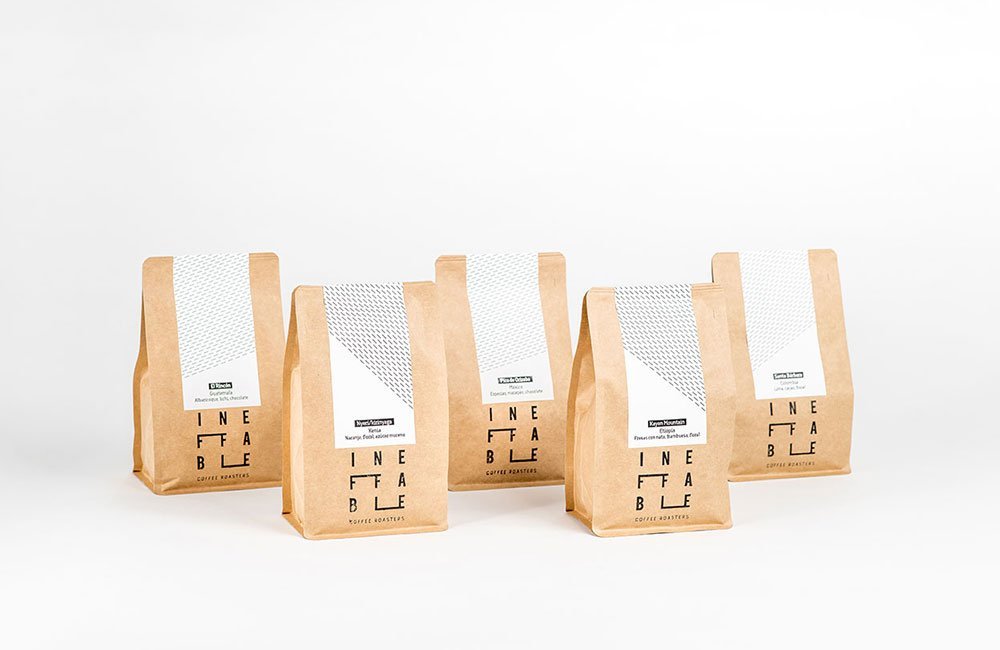
For each origin we have taken an axis from Seville to the farm, an axis unique to each origin and at the same time sharing a visual and aesthetic uniformity: Africans have a very inclined left to right axis, almost vertical, Brazilians are similar but inclined to the right and Central Americans are slightly less inclined, almost horizontal.
For us this grid has wants to enhance and symbolize traceability, each coffee bean harvested, each link in the coffee chain, each personal story, each hour of work of the countless that are necessary to bring this product to Europe.
The grid is a way of honoring and keeping present this chain of effort and hard work that is invested in each step that coffee takes.
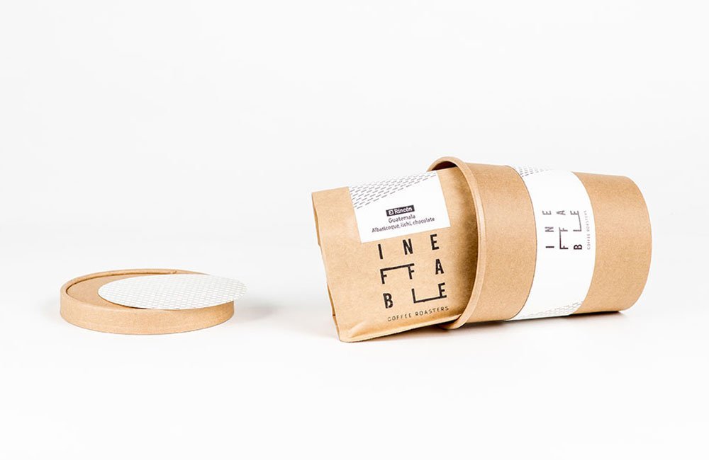
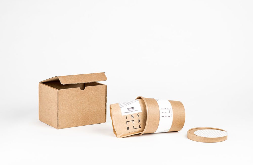
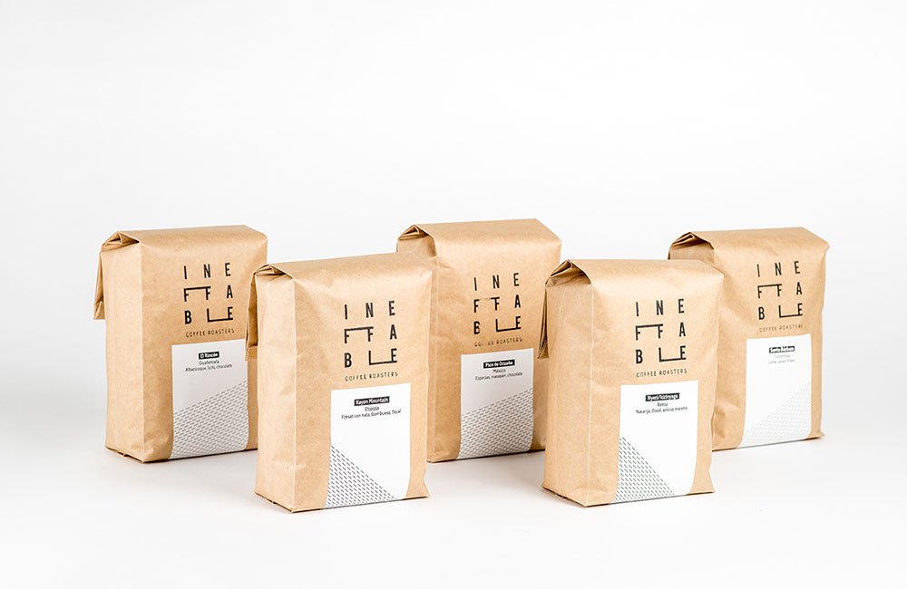
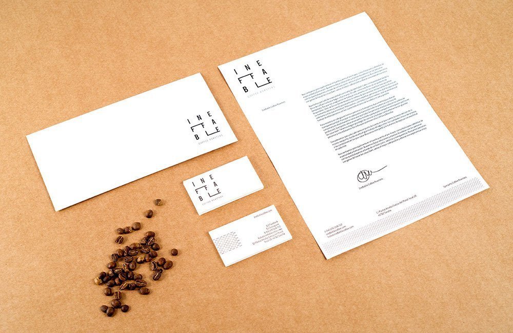
Photography by Miguel Jiménez.


